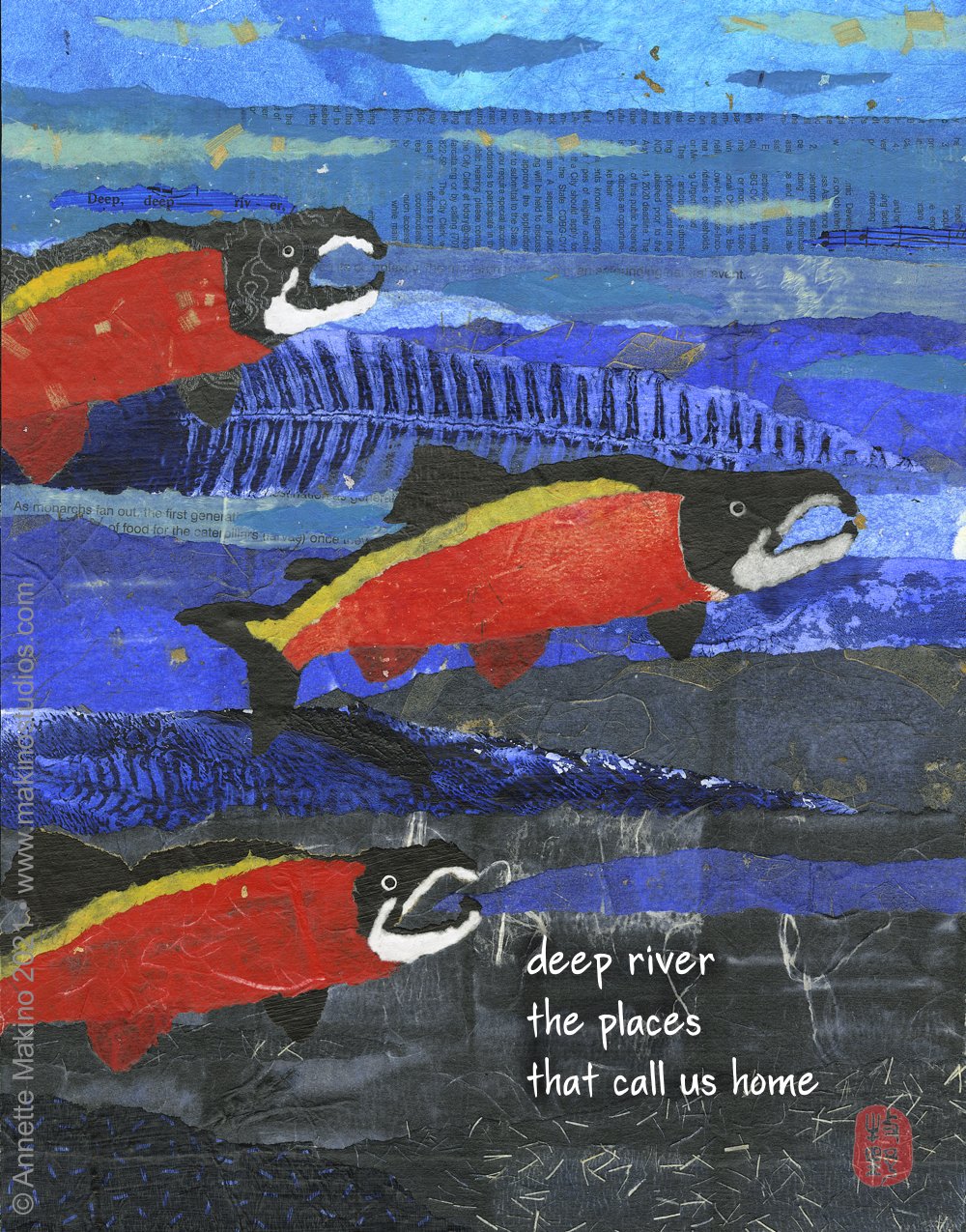
“deep river” is 11x14. This collage features three coho salmon swimming upstream, back to the place they were born. This piece is the January art for my 2022 calendar of art and haiku. As with all my collages, the papers start out white, and I then paint them with lightfast acrylic paint.
One fun detail is that the phrase "deep, deep river" appears on a scrap of a musical score. You can also see some prints I made from ferns, plus mango paper from Thailand, washi paper from Japan, newsprint, and even a toilet paper wrapper! I added the haiku using my Yuki font.
A new graduation card version reads, “congratulations—onward and upward!”
© Annette Makino 2021
There was a lot of interest in my last post, “How a collage is born.” So today I want to go behind the scenes again and share a bit about the process for my lettering.
For my paintings and collages, I typically make one version of a piece that includes a haiku and another with the words for a greeting card. I normally leave the words off the original.
I used to brush-paint each haiku or phrase using sumi ink, an ink stone and a bamboo brush. If you’ve ever tried painting or lettering using a brush and ink, you know it’s a delicate art with no room for error. So it would usually take me several tries to get right.
Then I would scan the words, edit out the white background, and digitally add the text to my art. This was a slow and painstaking process—with uneven results.
Traditionally you make sumi ink by grinding an ink stick in an ink stone. Photo by Brandi Easter.
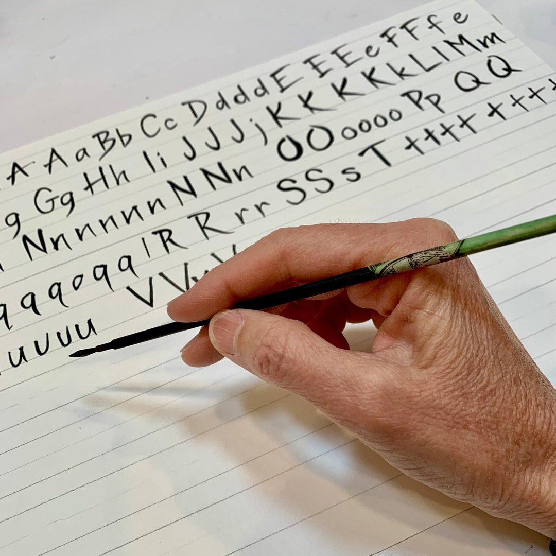
Here I am painting the letters for my custom font using sumi ink and a fine bamboo brush. I chose the best version of each letter for the font.
That changed last spring, when Arcata-based graphic designer and tech wiz Gabe Schneider at Sight Study created a custom font for me using my brush-painted letters. He used an extension for Adobe Illustrator and Photoshop called FontSelf, which turns lettering into OpenType fonts. He fine-tuned the spaces between letters (kerning and tracking), and even figured out a clever way to make a bold version.
A detail of my custom Yuki font based on the letters I painted above.
There are still situations when I will hand-paint my words. Sometimes I want a special look, as with the big section headings for my book, Water and Stone. Or sometimes a customer buys an original painting and wants the haiku on it. But I’m always nervous that I will ruin the painting with a typo or smear—it’s been known to happen!
With my new brush font, I can quickly and easily type the words for my haiku and greeting cards. I’ve used it for slide show presentations of my art and poetry, and it also works beautifully for the 365 dates on my calendar.
Is it “cheating”? Using my custom font may seem less Zen than painting each letter by hand in the traditional way, but it also creates less aggravation. And isn’t that actually more Zen? Plus, I get elegant, consistent results in a fraction of the time—giving me more time to write haiku and make art.
A quick Google search for “Asian brush font” returns 34 million results—but none of them are mine. I named my font Yuki, which means snow in Japanese. It also happens to be my middle name. I say let it snow, let it snow, let it snow!
rice paper moon
pine trees brush
the inky sky
•
Makino Studios News
My 2022 calendar uses my Yuki font for the dates—something I would never do by hand.
New card designs: I’ve created several brand-new card designs, including three birthday cards and one for graduation, and I’ve updated others with new words. Browse the whole card collection, including Valentine’s Day cards.
Sale on 2022 mini-calendars: My 2022 mini-calendars, featuring 12 colorful Asian-inspired collages with my original haiku, are now on sale for $9.99 (from $12.00). I like to think of these as a small rotating gallery of art.
My first book review: A new review of Water and Stone: Ten Years of Art and Haiku in Haiku Canada Review says, “The images in Annette Makino’s collection are lovely, the prose is limpid, and the haiku seem effortlessly to verbalize how we are part of the world.” You can find my book here, on Amazon and in select Humboldt stores. It is 8x10, perfect bound, full color, and 124 pages. $24.99.


